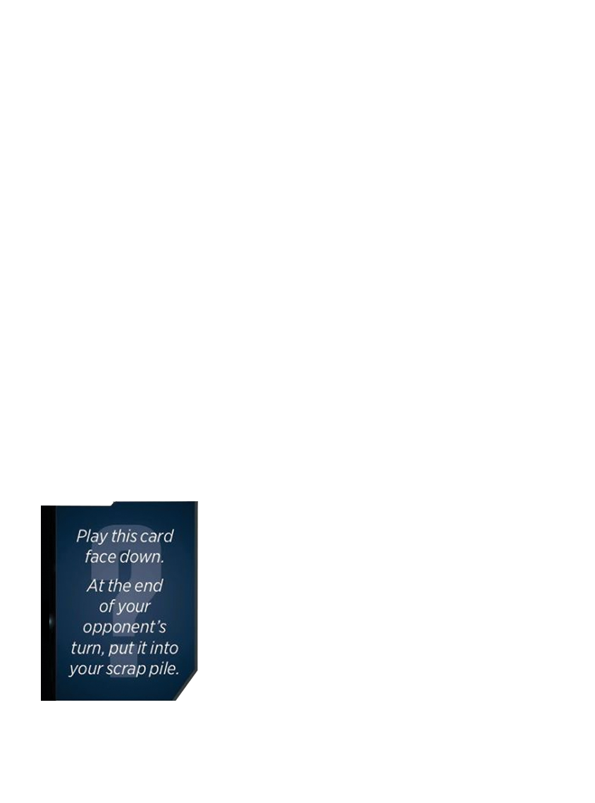
This style guide is a reference to ensure all our cards look the same and attempt to match what WotC did. To be clear, this is all in regards to a card's appearance and look, and has no bearing on a card's mechanics or how powerful it is. Jihen does have a useful
guide for that though.
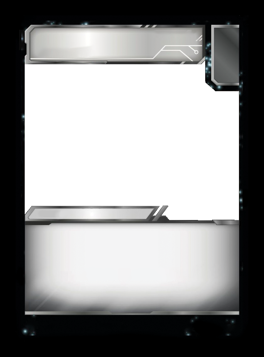
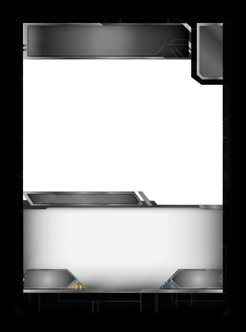
All cards should be 300 DPI, and have a 50px bleed. While most professional printers only require at least a 3mm (35px) bleed around the edge, some have been encountered that require more. 50px is 4.23mm and has been enough every where seen so far. Using Hasbro's
official sizing as a base, the chart below shows all our sizes, with and without bleed.
              300 DPI w/ Out Bleed           |  w/ Bleed
Small:         63 x  88 mm    744 x 1039 px  |   844 x 1139 px
Standard:      88 x 126 mm   1039 x 1488 px  |  1139 x 1588 px
Large:        143 x 200 mm   1689 x 2362 px  |  1789 x 2462 px
Slim:         143 x 200 mm   1181 x 1689 px  |  1281 x 1789 px
• Folding cards are the exact same sizes as Standard.
• Folding cards fold in half to become Small.
• Similarly, Broad cards are the exact same size as Large.
• Broad cards fold in half to become Slim.
Note: The individual pieces of a folding card (like the bot & alt mode on a combiner piece) should also have each of their pieces with full bleed. So, to use a typical triple changer as an example, you'd have four images in total:
• Small size: Alt Mode 1 as a small images w/ bleed.
• Small size: Alt Mode 2 as a small images w/ bleed.
• Standard size: Bot mode would be a standard sized image w/ bleed.
• Standard size: The folding image of the card, with Alt1 & Alt2 on it.
As a reminder, that means the two individual small-sized images won't exactly fit on the standard sized image due to the bleed they each have. The bleed on the inside has to be cut off. This can be automated on by clicking the "Generate New Image" button found on folding cards.
For reference: Transformers.cards stores numerous dicopies of each card. When you upload the bleed PNG, it'll save that, then duplicate, crop, and resize it as needed for various aspects of the site, OCTGN, TTS, etc.
Official Hasbro art is fine to use without any need for permissions. This includes images from licensed products, comics, packaging, games, marketing materials, and more. All fanart requires explicit permission from the artist to use it. Commissioned art does not require permission from the artist, but does require permission from the commissioner.
Artwork made for 3rd Party packaging/manuals may be used without obtaining permission, since the company themselves are infringing on Hasbro's IP.
Do not use poor quality images. To elaborate, this is not remark on the quality of the art, but of the image file itself. Avoid images that are very grainy or blurry. Upscaled JPEGs with artificating look very ugly as cards.
When adding art for the Card Image Generator to use, make sure it's sized accordingly.
Battle cards: 696 x 514 px
Characters: Full size with bleed (see sizes above)
Small Stratagems (front): 690 x 551 px
Small Stratagems (back w/ ability text): 690 x 681 px
Small Stratagems (back w/ stats): 690 x 974 px
Small Stratagems (back art only): 716 x 1011 px
NOTE: This list is being updated, and will have visuals to show what font is used where.
Cybertronian Text -
Ancient AutobotCard name:
Bayformers-TFTCG-Name [/small]WotC used an internal Hasbro font, this is the closest we have available to itCard subtitle: Bahnschrift Regular
Trait: Bahnschrift Bold
Card type: Source Sans Variable Bold Italic
Explanation text: Source Sans Variable Italic
Ability Text: Gotham Narrow weight=325 Condensed, baseline 7, kerning -0.3, full hinting 30px battle cards, 38px standard char
Card Number (small cards): Bahnschrift Bold, 33px, bolded, no hinting,-2 kerning
Set total (small cards: Bahnschrift Semi-Bold Semi-Condensed, 21px, bolded, medium hinting, 0 kerning
Wave (small cards): Bahnschrift 17px, 12px for version, kerning 0
Wave (standard cards): Bahnschrift 19px, 13px for version, kerning 0
Wave (large cards): Bahnschrift 28px, 19px for version, kerning 0
Credits: Bahnschrift Condensed 14px
Printer notice (small): Bahnschrift Bold Semi-Condensed 14px
Printer notice (standard): Bahnschrift Bold Semi-Condensed 17px
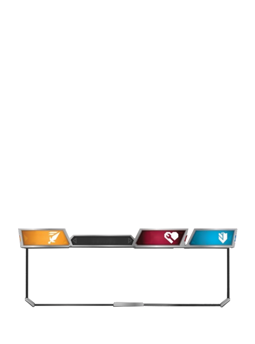
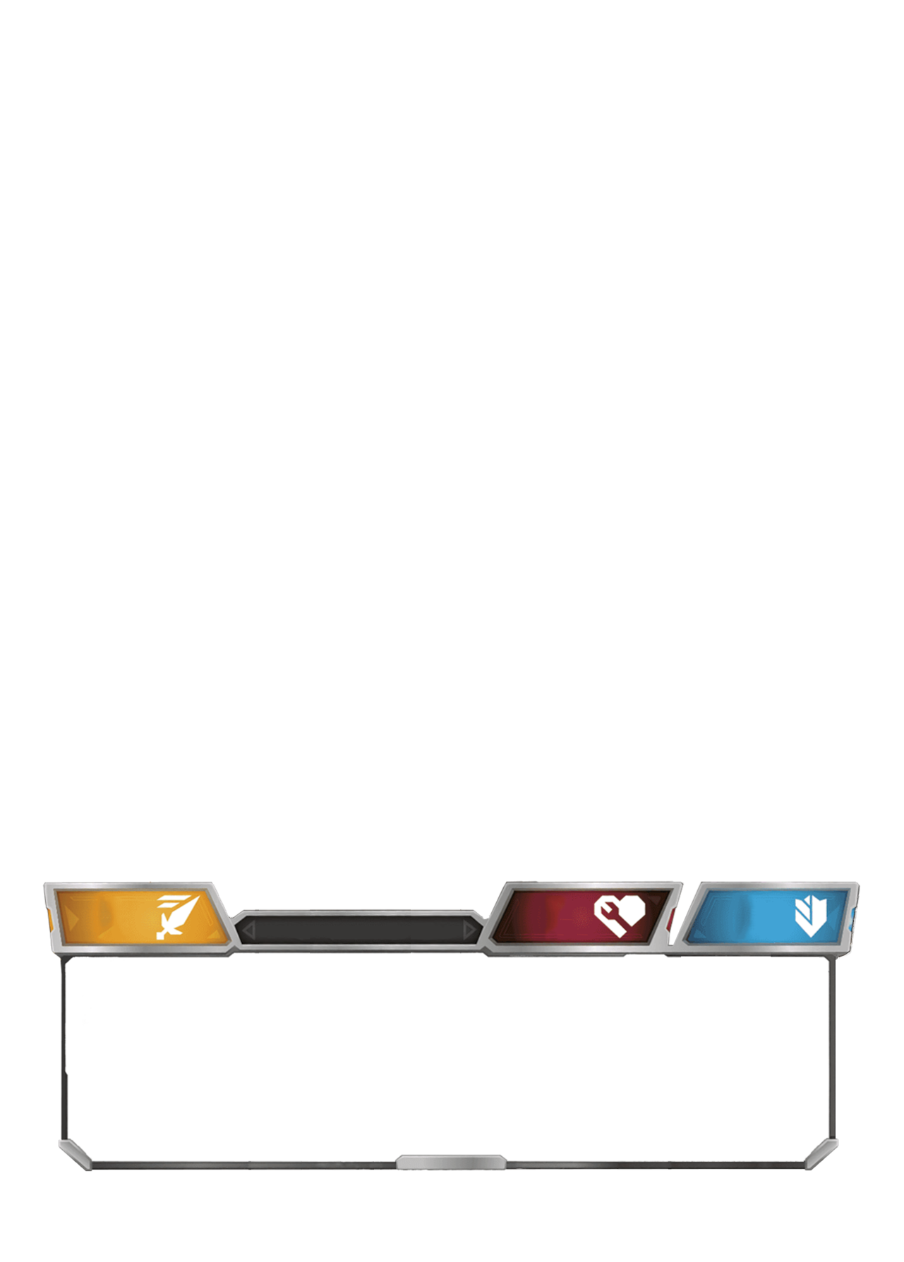
Thanks to Team Bayformers for taking the time and effort to figure these all out and letting others use their Name font.★value always goes on the bottom left. On character cards, it goes on whichever side is meant to be face-up when the game starts (typically the alt-mode).
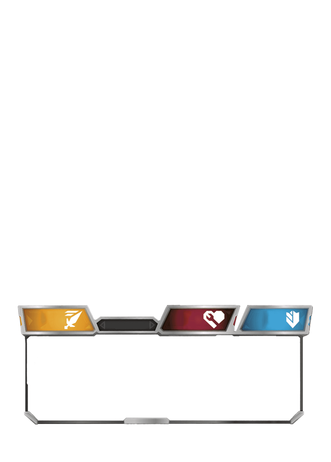
Character cards with 13★ or fewer have them lined up and divided into three groups of five, each separated by a vertical bar ( | ). These bars are visible even if not needed. Example:
Sergeant Mirage has 7★, but still had the three sections separated by the vertical bars.
Character cards with 14 ★ or more use numbered stars (stars with numbers on them). These are not broken into sections, and are instead lined up in row. Example:
Major Shockwave has 14★, and no vertical lines separating sections.
Non-character cards with 3★ or fewer have them lined up. Non-character cards with 4★ or more should use numbered-stars.
Even though we're not opening physical packs, rarity is still required on all cards. It's vitally important for formats like Junkion (where you can only use Common cards), and SR is also used to indicate a specialty/niche card.
C = Common
U = Uncommon
R = Rare
SR = Super Rare
While creating new a new rarity is not strictly prohibited, doing so must serve an actual purpose in the game. So far there has not been a reason to.
Character cards add a T after their rarity, such as CT or SRT. Non-character do not do this; there is no S in front of a stratagem rarity.
Battle cards use triple-digit numbering, and all other cards use double-digit numbering. Character cards and stratagems have a T and S in front of their number, respectively.
The total number of that type of card in the set follows in a smaller font.
Promos have a P in front of their number. All promos use double-digit numbering, including battle card promos. Example:
Tandem Targeting System mailed to Energon Edition buyers.
Promos are numbered sequentially by year regardless of type. Example:
All-Out Attack is the 11th promo of 2019, despite being the first battle card promo. This numbering resets every year. Additionally, Promos list the year they were released rather than the total number of cards in the set.
Promos are in the subset P of their parent wave. For example,
Private Smashdown is Wave 3P and
Convex is Wave 5P.
Promos use standard rarity denotation.
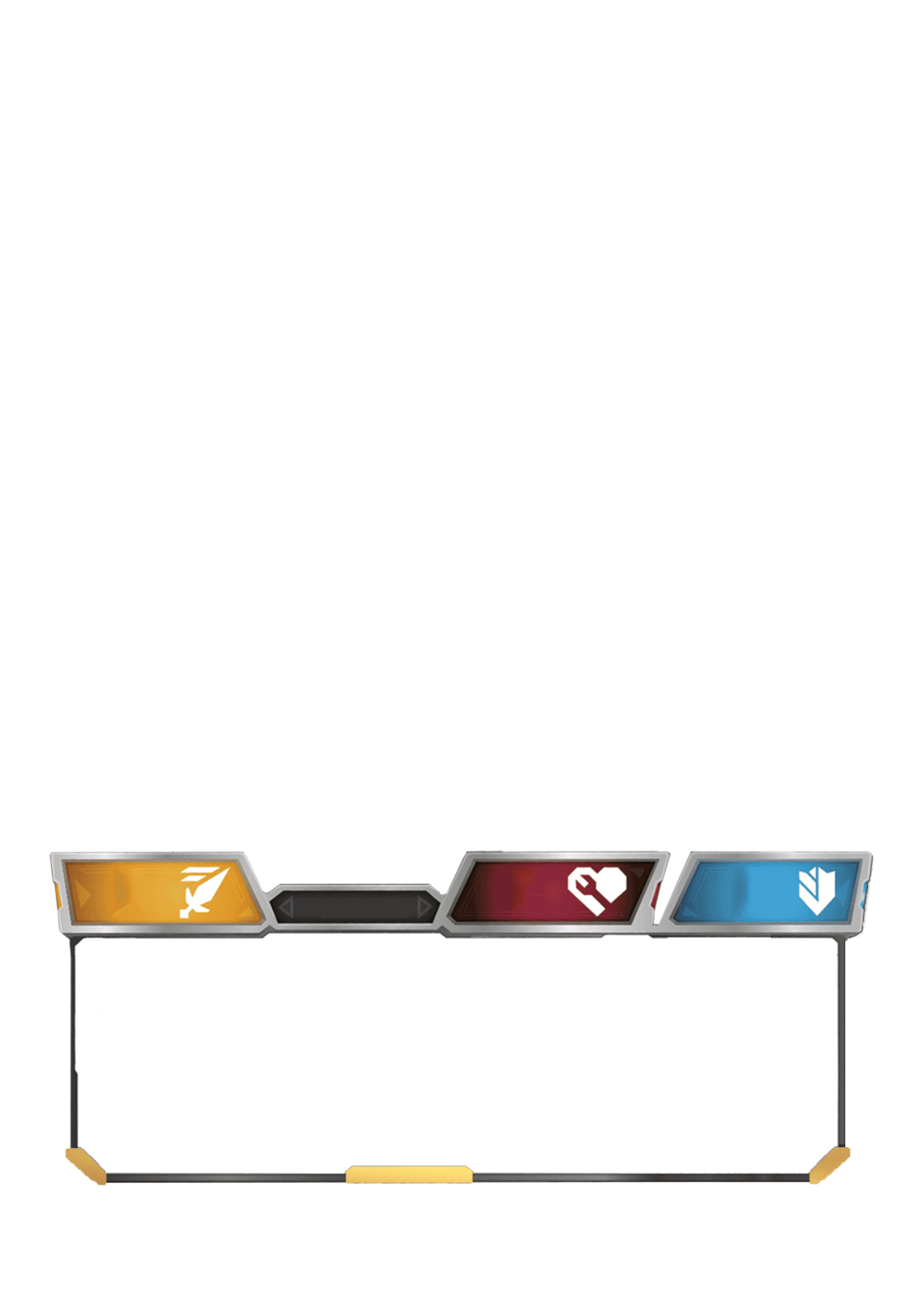
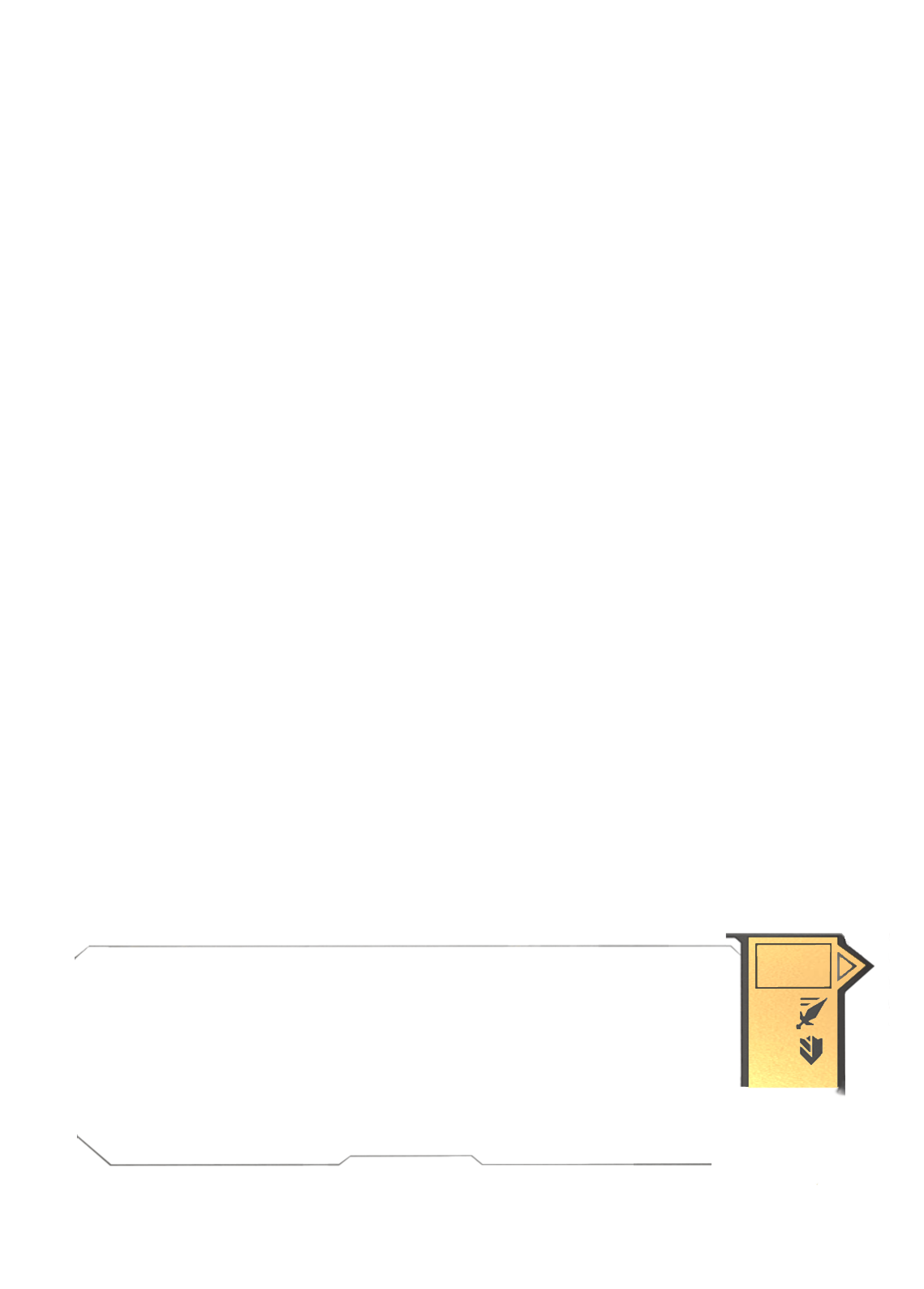
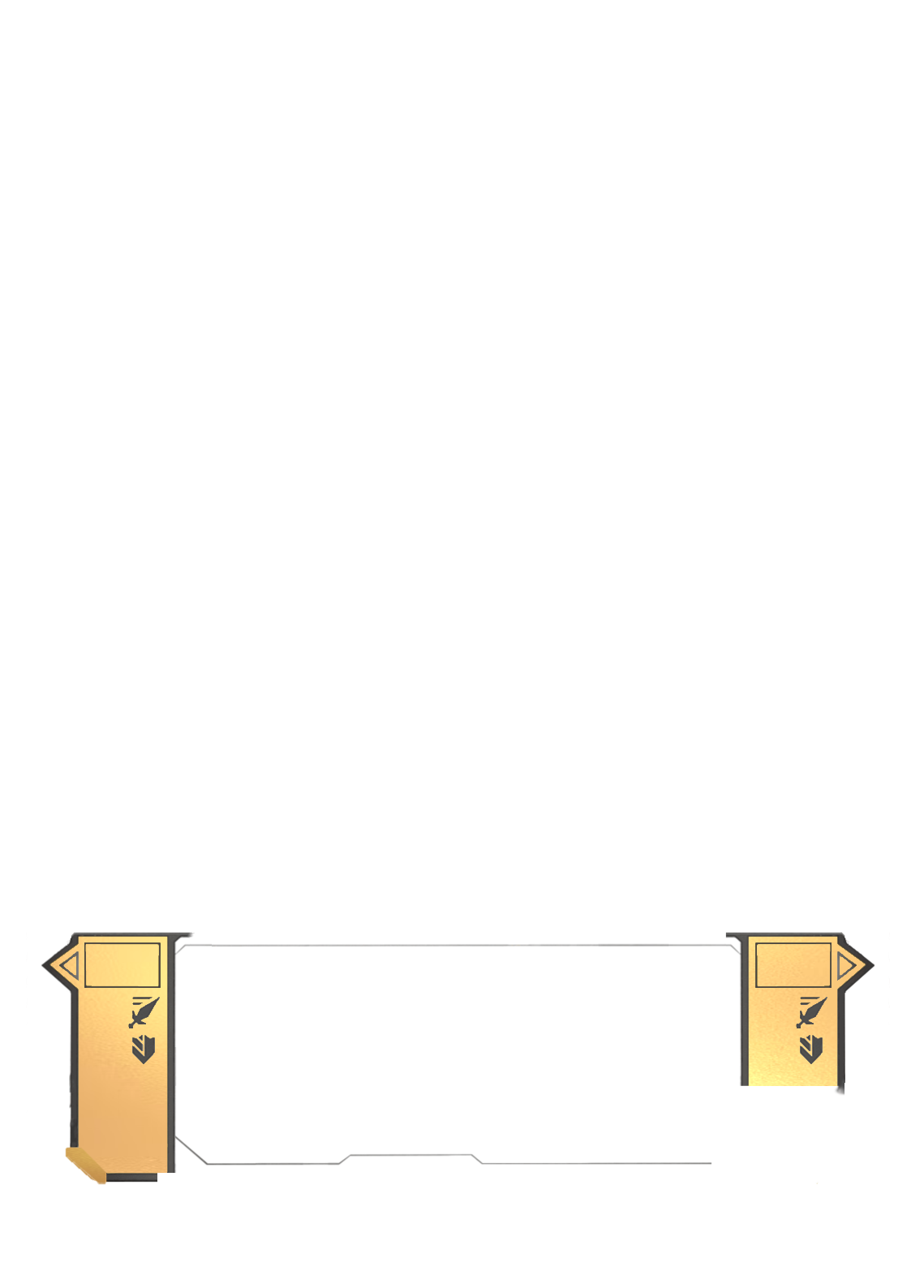
Set icon & ID should usually go in the bottom left of a card. However, if there is instead a ★ value on that side of the card, then they go to the right of the card numbering. Example:
Bombing Run has no stars and the set is in bottom left, while
Ultra Magnus Armor has 2★ so the numbering is to the right of the numbering.
This holds true for stratagems as well; if the stratagem doesn't have a ★ value, the set goes in the bottom left. Should there ever be a character card without a ★ value, the set would go in the bottom left then too.
Set icons are unique to each wave, and sub-sets use the same set icon as the main wave does. Example: The Devastator Set (Wave 2A) uses the same set icon as Rise of the Combiners (Wave 2).
Granted, the Blaster vs Soundwave Set (and the 35th Anniversary version) do not use the Wave 3 set icon, but I don't believe it was ever officially referred to as "Wave 3A" so that will be considered the exception.
Set icons are also made up of geometric shapes, and are not meant to be exactly representative of the set. For example, a shrunken picture of a bot is not a good set icon.


